How students are doing
District performance from the 2025 Annual Performance Report ( / ) — the overall score plus its building blocks: English, math, college-and-career readiness, and attendance. A pattern runs through all of them: achievement follows poverty. So this page also asks four harder questions — what provisional accreditation does and does not mean, how poor Missouri’s children actually are (the school lunch numbers no longer tell you), which districts beat the odds their demographics predict, and how far the pandemic set students back, five years on.
What this page shows
- About one Missouri child in seven is estimated to live below the federal poverty line — 13.9% of children ages 5–17. But the free/reduced-lunch rate, the number schools leaned on for thirty years, is no longer a poverty measure: 56 districts report exactly 100%, and one reports more than 100%.
- Missouri lists five districts as provisionally accredited and none as unaccredited. Their academic results merit attention even beside other high-poverty districts, but the five do not share one simple financial profile.
- Economic disadvantage tracks closely with where students stand and only faintly with how fast they gain ground. In matched 2009–2019 data, average free/reduced-lunch enrollment accounts for about 42% of the variation in achievement level but only about 3% of the variation in learning rate.
- Five years on, Missouri students score 0.70 grade levels below where they were in 2019, and only 40 of 346 districts with reliable data have fully recovered.
Five maps, five ways to read Missouri achievement
Every map on this page at a glance — what each one shows and how to read its colors. Tap any card to jump to the full analysis.
Annual Performance Report, 2025
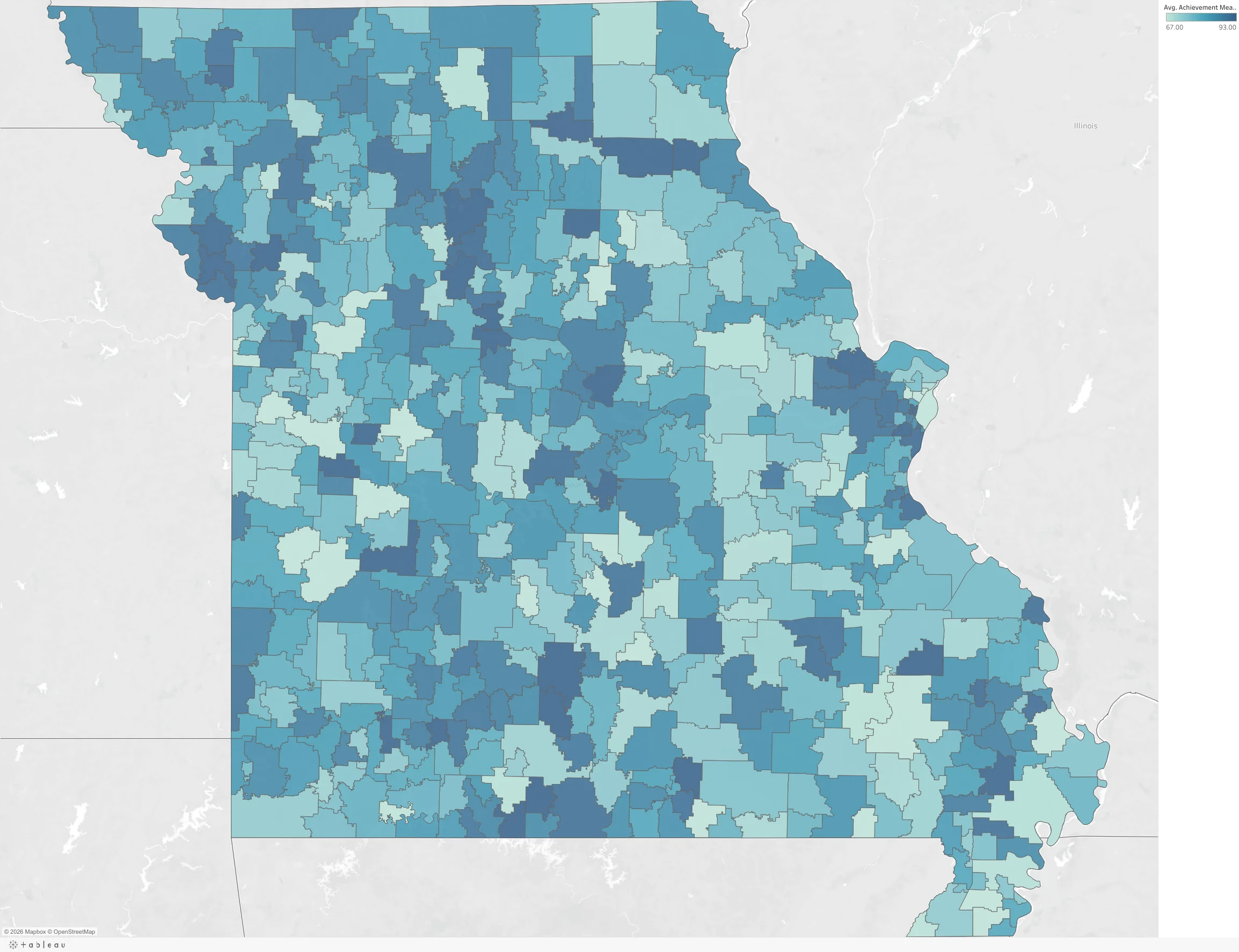
The share of accountability points each district earned — Missouri’s single summary of district performance — and the two academic measures underneath it. Use the Achievement Measure selector on the map to switch between the APR score, English language arts, and mathematics.
The APR also scores college & career readiness and attendance. We have deliberately not mapped them, because they are not continuous measures: DESE awards them in bands, and almost every district lands on one of four values — 0, 50, 75 or 100. Shading a map by a four-value score invents a geographic gradient that does not exist. The honest presentation is a table.
| District type | APR score | ELA (MPI) | Math (MPI) | points | Attendance points | Districts |
|---|---|---|---|---|---|---|
| City | 80.8 | 379.2 | 366.2 | 50 | 50 | 14 |
| Suburb | 86.0 | 401.8 | 397.2 | 50 | 75 | 45 |
| Town | 79.0 | 385.7 | 377.5 | 50 | 75 | 69 |
| Rural | 80.3 | 383.6 | 373.4 | 50 | 100 | 388 |
| Missouri median | 80.5 | 384.6 | 374.8 | 50 | 75 | 516 |
Five districts are provisionally accredited. None is unaccredited.
That is Missouri’s official February 2026 classification, not a label created by this website. The state’s detailed tables identify Hayti R-II, Hickman Mills C-1, Normandy Schools Collaborative, Riverview Gardens and St. Louis Public Schools as provisionally accredited. Their results deserve direct attention. But the label is a starting point for investigation — not a diagnosis of one cause and not a verdict on every school, teacher or child in the district.
Source: DESE’s February 2026 detailed classification tables. The PDF’s summary box says 512 accredited and 517 total; its district-by-district tables contain 511 accredited and 516 total. Every detailed code matches the site’s 516-district geographic master, so the site reports the detailed rows and discloses the one-district source discrepancy. These accreditation totals concern the geographic district panel; Missouri’s two special school districts are outside this comparison.
| District | Community | Enrollment | 2025 APR | Child poverty | Enrollment since 1991 | Average teacher experience |
|---|---|---|---|---|---|---|
| Hayti R-II | Rural | 572 | 74.4 | 43.7% | −45.3% | 14.9 years |
| Hickman Mills C-1 | City | 4,684 | 80.5 | 24.0% | −35.6% | 9.9 years |
| Normandy Schools Collaborative | Suburb | 2,589 | 51.0 | 33.7% | −56.2% | 8.6 years |
| Riverview Gardens | Suburb | 4,883 | 69.5 | 36.0% | +3.3% | 8.6 years |
| St. Louis Public Schools | City | 16,211 | 66.5 | 31.3% | −62.5% | 8.0 years |
The five districts serve very different places — two city systems, two inner-ring suburbs and one rural Bootheel district. All five have child-poverty estimates of at least 20%, so the middle column below compares them with the 137 other Missouri districts where at least one in five children is estimated to be poor. That is useful context, not a matched study or an excuse for low results.
| Median district measure | Five provisional districts | 137 other high-poverty districts | All 516 mapped districts |
|---|---|---|---|
| APR points, 2025 | 69.5 | 77.6 | 80.5 |
| ELA performance index, 2025 | 335.0 | 379.9 | 384.6 |
| Math performance index, 2025 | 304.2 | 367.8 | 374.8 |
| Child poverty estimate, 2024 | 33.7% | 23.9% | 15.4% |
| Enrollment change, 1991–2025 | −45.3% | −21.5% | −13.8% |
| Average teacher experience, 2025 | 8.6 years | 12.6 years | 12.6 years |
See why this is not a simple funding story
Across the five provisional districts, the median current expenditure is $19,968 per student, the median average teacher salary is $57,308, and median assessed property wealth is $150,908 per student — all above the statewide district medians of $13,255, $48,603 and $130,885. But those medians combine very different districts. Hayti’s assessed wealth is only $57,645 per student; St. Louis City’s is $338,639. Per-pupil spending can also rise when enrollment falls because fixed costs are divided among fewer students, and metropolitan salary levels reflect a different labor market than rural pay.
The honest conclusion is that the five do not share one simple financial diagnosis. District-level totals cannot establish whether resources are adequate, efficiently used or causally related to results. They can show that the accountability concern is real, that the communities face substantial challenges, and that any proposed remedy should be tested against each district’s actual circumstances rather than one statewide stereotype.
The poverty map the school data cannot give you
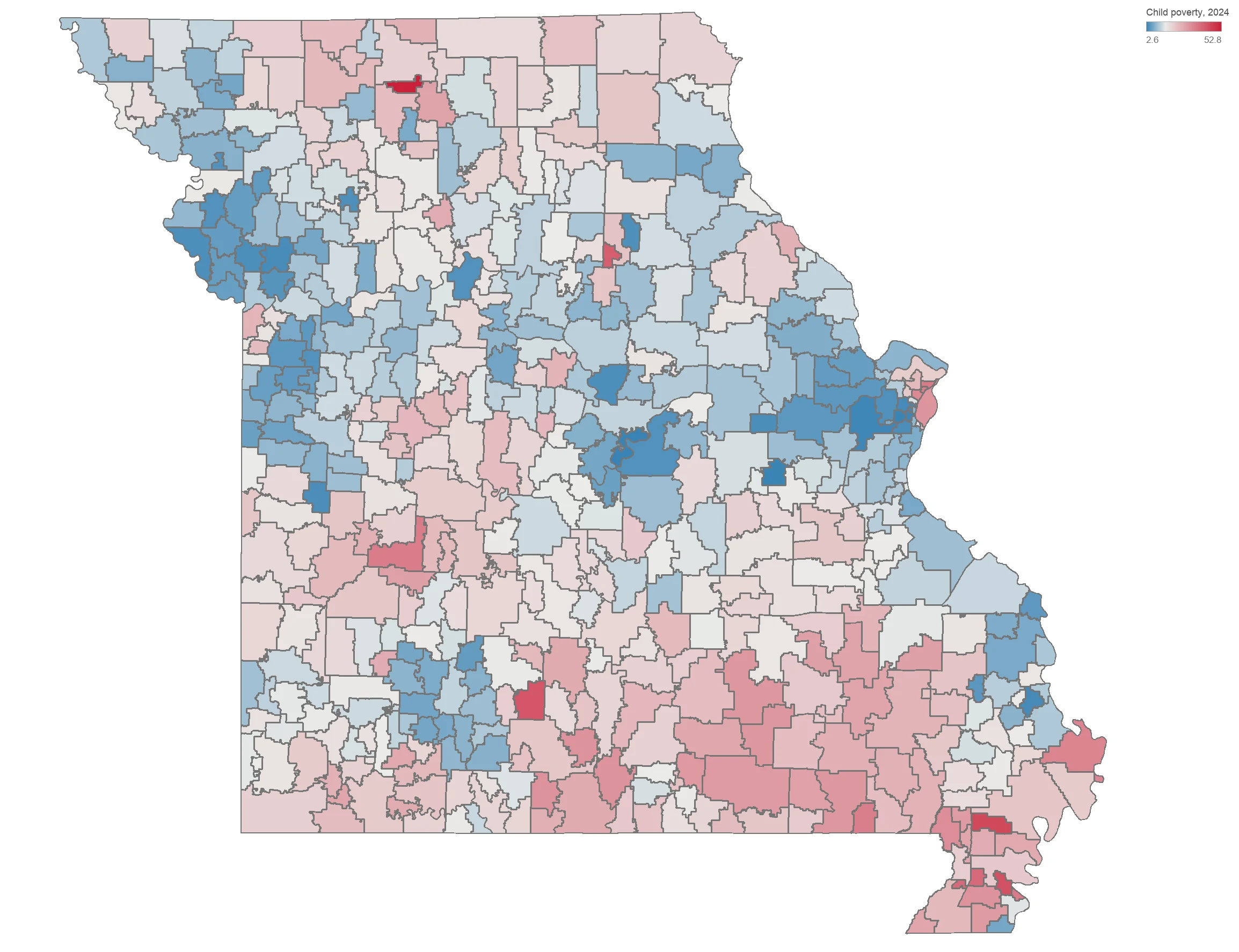
Every claim on this page rests on a measure of poverty — and for thirty years the measure schools used was the free/reduced-lunch rate. That measure is now broken. Since Missouri districts began adopting community eligibility, which lets a high-poverty school feed every child for free without collecting a single family income form, a district’s reported free-lunch rate says as much about its paperwork as about its families. So this map sets school data aside entirely and asks the Census Bureau instead: what share of the children living inside each district’s boundaries is actually poor?
View the numbers as a table
| Community type | Districts | Median child-poverty rate |
|---|---|---|
| Rural | 388 | 16.4% |
| Town | 69 | 14.3% |
| Suburb | 45 | 8.8% |
| City | 14 | 16.3% |
| All districts (median) | 516 | 15.4% |
Poverty is not only an urban story. The median rural district has a 16.4% estimated child-poverty rate — almost identical to the median city district (16.3%) and substantially higher than the median suburb (8.8%). Rural poverty is simply more spread out, and therefore easier to miss.
None of that is fraud. It is community eligibility working as designed: feed every child, ask no family to fill out a form. But it means free-lunch rate is no longer a poverty measure — and any funding formula, research study, or news story that still treats it as one is measuring the wrong thing.
Annual estimates need care. Because SAIPE is model-based, rates for small districts can move sharply between annual vintages. Eighty districts moved more than five percentage points from 2023 to 2024; most enroll only a few hundred students. Treat a one-year change as an estimate, not proof of a local trend, and check several years or local evidence before drawing conclusions.
Which districts outperform what poverty predicts
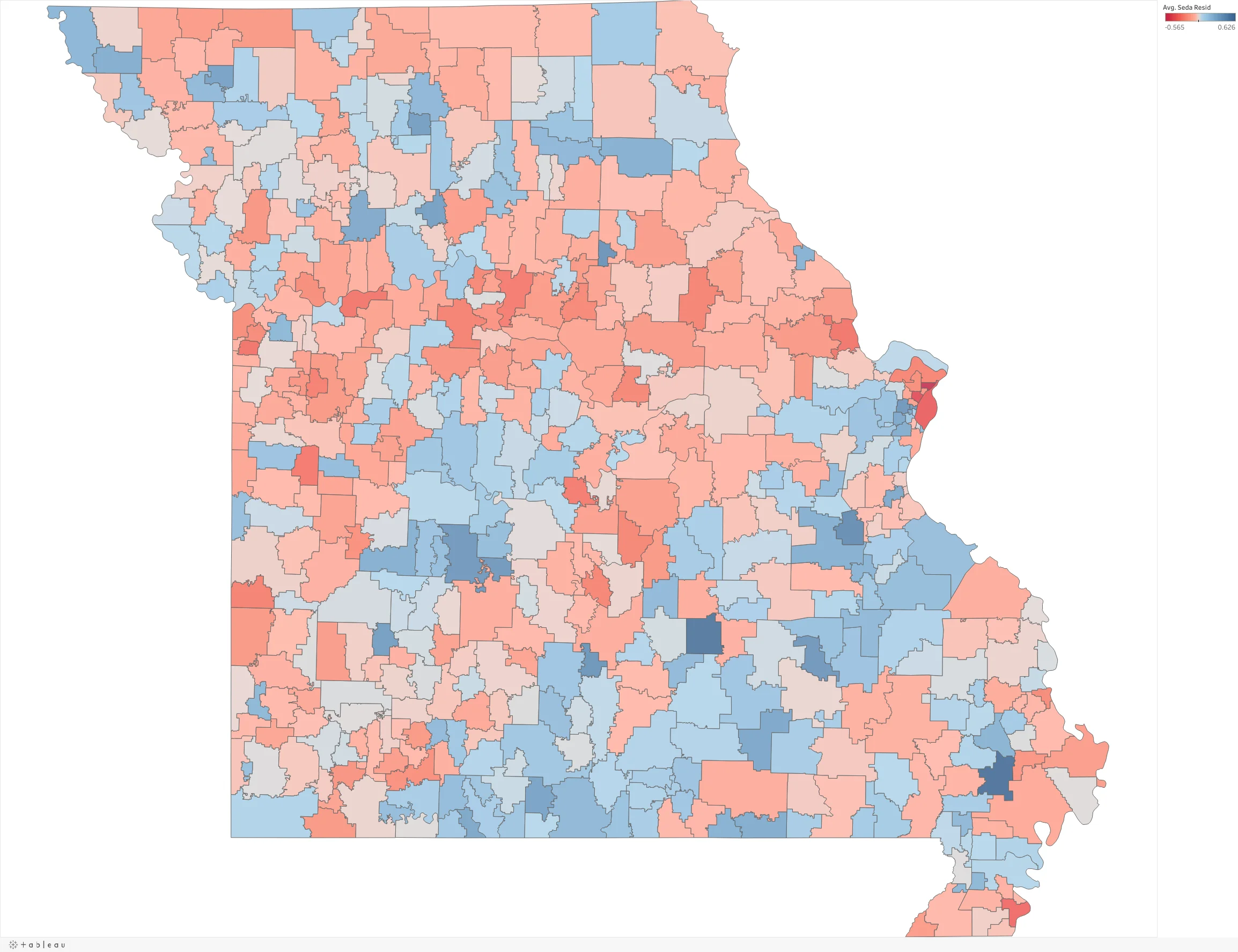
Poverty explains a great deal of Missouri’s test-score map — but not all of it. This map compares each district’s actual achievement against what its poverty rate alone would predict. Blue districts score above expectation, red below; the center of the scale is exactly zero, meaning “performing as predicted.” It is the one map here that asks not who is ahead, but who is doing more with what they have.
The state’s biggest over-performers are largely high-poverty rural districts: Richland R-I in the Bootheel (about 68% free/reduced lunch) leads Missouri at +0.63 SD above prediction — roughly two grade levels better than demographics would forecast — with Kingston K-14 (85% FRL), Green Forest R-II, Middle Grove C-1 and Manes R-V alongside Ladue and Clayton at the top. The lowest residuals cluster in the St. Louis inner ring (Riverview Gardens −0.57, Normandy −0.45, St. Louis Public Schools −0.39). And once poverty is controlled, the median residual for rural, town, suburban and city districts is all about zero — rural Missouri is not behind.
That is why the number can run opposite to a district’s raw scores. A wealthy district can post some of the highest test scores in Missouri and still land near zero here — it is doing about what its low poverty would predict — while a high-poverty rural district can score below the state average and still be one of Missouri’s biggest over-performers. Zero is not failure and blue is not a trophy: this is the closest indicator on the site to what a school itself may be contributing, once the economics are set aside — though, like any measure built from observational data, it cannot fully separate a school’s own effect from everything else that differs between districts. (Rough anchor: ≈ one grade level.)
How fast students learn, not how much they know
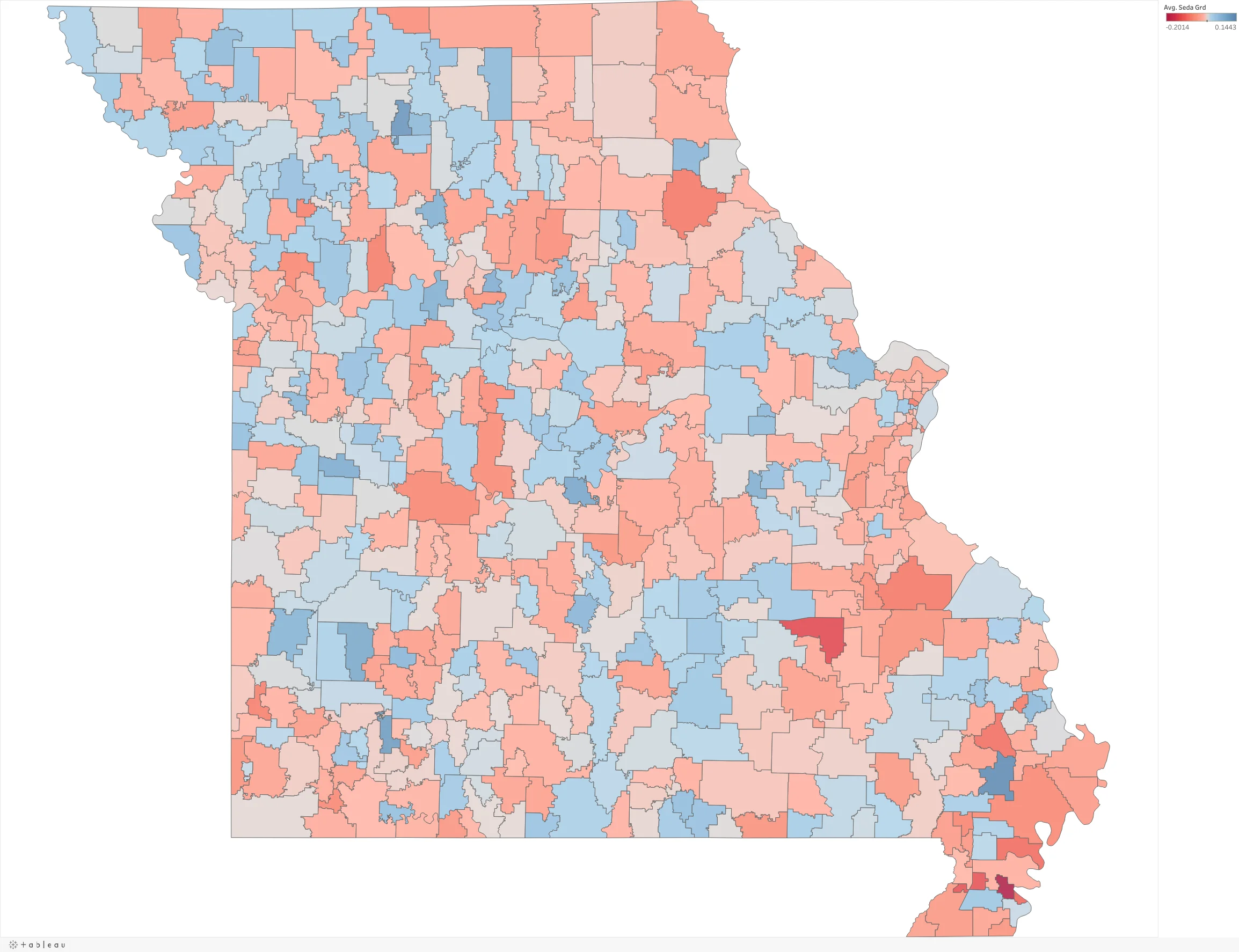
Every other achievement map on this page measures what students know at a moment in time — and what students know is shaped by everything that happened before they walked through the door. This map measures something different and, arguably, fairer: how much students gain each year compared with the typical American district. It is the closest this site can get to measuring what a school itself may contribute — a useful indicator, not proof of cause and effect.
Put plainly: economic disadvantage tracks closely with where district students stand and much less strongly with how fast they gain ground. That difference is important, but it is not a complete explanation of either outcome. Learning-rate estimates are also less precise, particularly for small districts, so the 3% figure should be treated as a descriptive result that still deserves additional sensitivity checks. Roughly 226 of 511 Missouri districts grow their students faster than the average American district, and they are scattered across the map rather than clustered in the wealthy suburbs.
The strongest learning rate in the state belongs to Richland R-I — a high-poverty Bootheel district that is also the state’s biggest over-performer on the Beating the Odds map above. Whatever is happening there is worth understanding.
Where teacher workforce fits. In a separate comparison using that same matched window, teacher salary, advanced-degree share and experience each have a modest positive association with achievement level (r = .25 to .29), but little or a negative association with learning rate (r = −.18 to −.02). Broad current expenditure per pupil is associated with essentially none of the variation in achievement (r = .00) and only a small share in learning rate (r = .12). These are associations, not effects. Read the plain-language interpretation on Teachers and the full design in Methods.
How strongly economic disadvantage is associated with each outcome
| Outcome | Child poverty r (n) | R² | Current FRL r (n) | R² |
|---|---|---|---|---|
| SEDA achievement level | −0.458 (516) | 21.0% | −0.590 (513) | 34.8% |
| ELA performance index | −0.387 (516) | 15.0% | −0.508 (513) | 25.8% |
| Math performance index | −0.356 (516) | 12.6% | −0.495 (513) | 24.5% |
| College/career readiness | −0.270 (445) | 7.3% | −0.317 (445) | 10.1% |
| Annual Performance Report | −0.268 (516) | 7.2% | −0.317 (513) | 10.1% |
| SEDA learning rate | −0.224 (511) | 5.0% | −0.199 (508) | 4.0% |
Those maps describe the decade before the pandemic — the stable, long-run picture. This one describes what happened after.
Missouri students are still two-thirds of a grade level behind
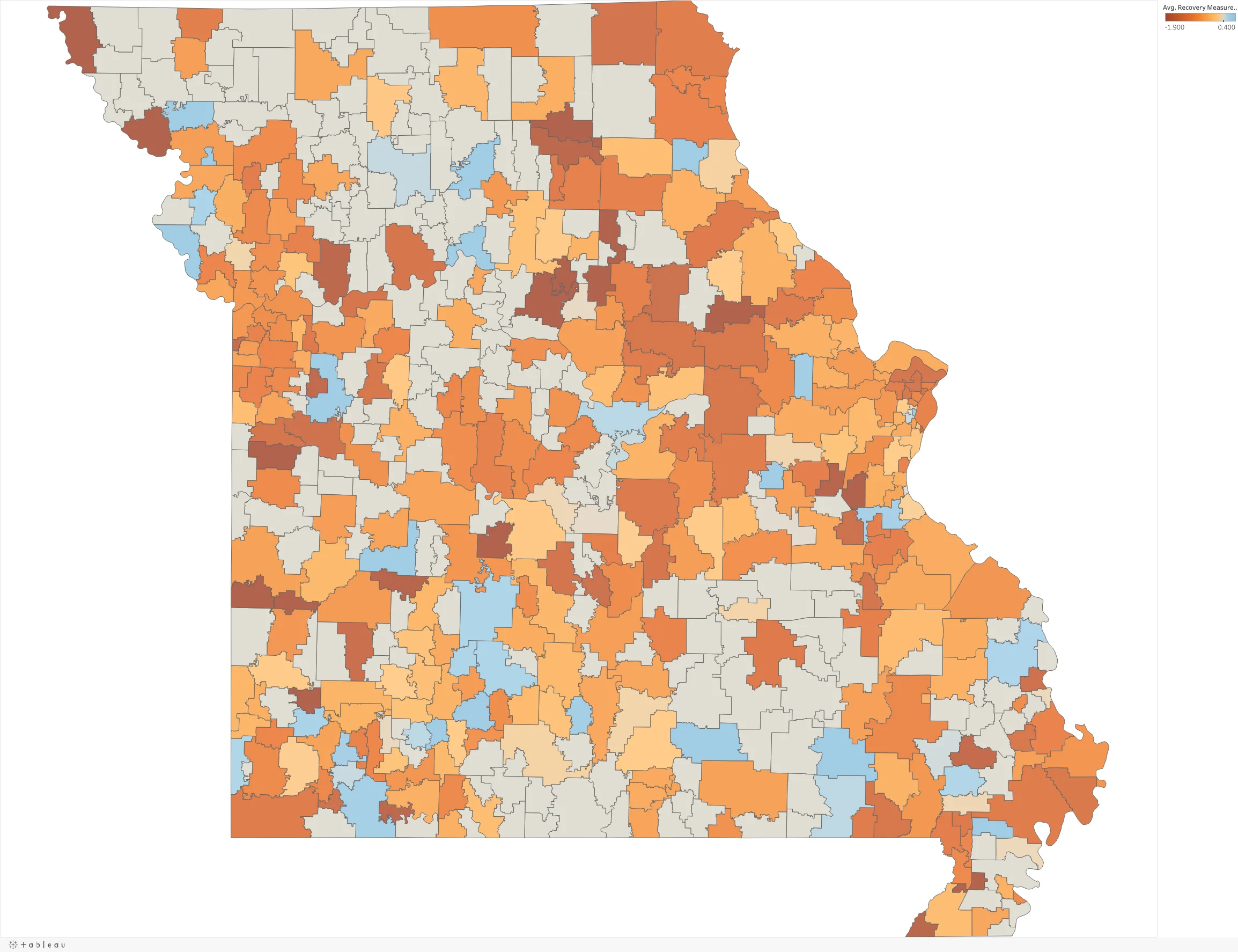
One map, five questions. Use the Recovery Measure selector to move between them: how far each district sits from its own 2019 scores, the same split into math and reading, whether it rebounded between 2022 and 2024, and where it stands today against the national average. Everything is measured in grade-level equivalents. Red is below, blue is above, zero is no change.
Now switch to the rebound. If recovery were underway, that view would be mostly blue. It isn’t. Missouri lost 0.62 grade levels between 2019 and 2022 — then lost a further 0.08 between 2022 and 2024. Only 100 of 318 districts gained any ground at all. The pandemic’s academic cost is not a receding problem that time is quietly solving.
And where districts stand now: only 64 of 346 — 18% — test above the national average. The median Missouri district is 0.81 grade levels below it. At the bottom sit the same inner-ring St. Louis districts that anchor every other map on this page: Riverview Gardens (−4.25) and St. Louis City (−4.24), more than four grade levels below the national mean.
Five maps, and one uncomfortable pattern
The strongest pattern appears in the matched 2009–2019 SEDA measure: average free/reduced-lunch enrollment accounts for about 42% of the variation in district achievement level, but only about 3% in learning rate. Those percentages belong to those specific matched measures, not to every map on this page. The broader lesson still holds: read a district’s score alongside the economic circumstances of the children it serves.
A district’s test score is not a grade for its teachers. It is closer to a photograph of the community around the school. Economic disadvantage is much more closely associated with Missouri district scores than with learning rate. Current per-pupil spending and APR are almost unrelated across the 513 nonvirtual districts (r = +0.030), but that does not mean money is unimportant: district-level data cannot identify what the additional dollars buy or what results would have been without them.
So if you want the closest available indicator of what your school itself may be contributing, look at two maps and ignore the rest: how fast students learn, and whether the district beats what its poverty predicts. Those come closest to asking what the school did with the children who walked through the door, though neither can fully rule out other explanations. On the growth map, economic disadvantage explains very little of the difference among districts — high-poverty districts grow students at roughly the same range of rates as low-poverty ones.
These maps give you the two defenses that actual data supports. First, 226 of 511 Missouri districts grow faster than the average American district — growth is where schools show up in the numbers, and Missouri looks far better on growth than on level.
Second, and harder: the pandemic hole is not closed. On average, Missouri students are still about 0.70 grade levels below 2019 — a comparison of the 2024 group with the 2019 group, not the same children over time — and only 40 of 346 districts have recovered. Reading (−0.73) is worse than math (−0.63) and has rebounded less. If your board is being told recovery is finished, it is not.
The measure this state has used to target poverty aid for thirty years no longer measures poverty consistently. Free-lunch rate and estimated child poverty now correlate at only r = 0.65; 56 districts report exactly 100% of students qualifying and one reports more than 100%, while their Census poverty estimates run from 13% to 53%. Any formula that still keys on free-lunch counts is distributing money on a number that has quietly stopped meaning what it says.
The second finding worth your attention: once poverty is controlled, rural Missouri is not behind. The median rural district performs almost exactly as predicted. The gap is a poverty gap, not a rural gap — and that points at a different policy than the one usually proposed.
Report-card scores get used to rank towns, price houses, and decide where families move. These maps show why that ranking must be read with economic context. A low APR is associated with the circumstances of the children a district serves — it is not, by itself, a verdict on the people teaching in its buildings.
And the reverse deserves saying too: a high-scoring suburban district is not necessarily doing more for its students than the small rural district down the road. Several of the districts that most exceed what their circumstances predict are among Missouri’s poorest.
- Where does our district sit on the Beating the Odds map — are we above or below what our poverty rate predicts? That is a fairer question than “what is our APR,” and it is the one worth taking to a board meeting.
- What does the Census say our real child poverty rate is, and how does that compare to the free-lunch figure we report? If those two numbers are far apart, which one is our budget, our grants and our staffing built on?
- Have our students recovered from the pandemic — and did anyone here ever tell us they hadn’t? Statewide, reading has recovered less than math. Ask what changed in our reading instruction since 2019, and whether it was enough.
- Are our students growing faster or slower than the typical American district? A district can be below the state average in scores and still be doing excellent work. Growth is where you would see it.
- If we outperform our poverty rate, what are we doing — and are we telling anyone? Missouri’s biggest over-performers are mostly small, poor, rural districts nobody writes about.